The Context
healthy eaters need to quickly find adapted recipes
There are so many healthy eating applications and platforms in the market, from the calory tracking apps to the the recipes planning apps, but none of these allows the users the ability to plan adapted recipes and be able to order this recipes on the same platform.
The Objective
Conduct User Research , And Design A User-centric Interface.
Research and ideate and design a native app that would help healthy eaters to be able to quickly find and shop for their adapted meals and recipes plans on the same platform, with the focus to that this solution would encourage people to cook more healthy at home. The project was broken down into the following three phases;

Empathize
We interviewed 5 users who say they are conscious healthy eaters. We also conducted brand competitive and feature analysis.

Conceptualization
With all the insights we got we needed to synthesize them and priotise screening insight and and then we brainstormed on the best ideas to implement solutions

Design & Testing
Now it was time to sketch concepts, wireframes and design screens and and prototype them.
Empathize
Since we lacked a proper understanding of the users’ needs and challenges, we conducted surveys, interviews and analyses of some users and existing brands.
The Steps
1. Brand Analysis
2. Feature Analysis
3. Qualitative Survey
4. User Interviews

Brand And Competive Analysis
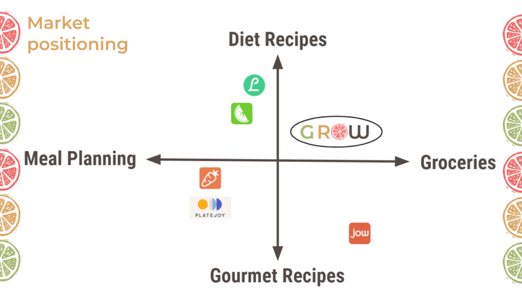
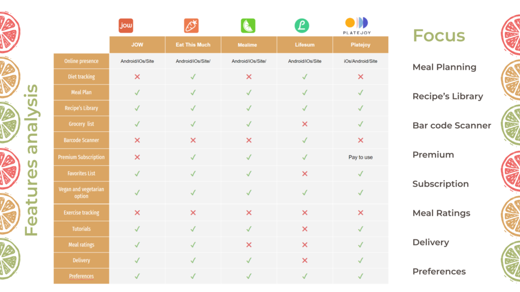
During our research, we found out that many brands and platforms are providing similar services to help healthy eaters easily find healthy recipes and ingredients for their home cooking. However, we noticed that non of these platforms allows their users the ability to shop for their recipes directly on the same platform. Below are the images showing the brand positioning for our future platform and the existing platforms, as well as the feature analysis for these platforms.
Survey
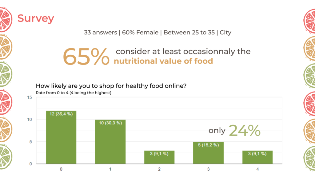
With lean survey canvas, we created a questionnaire, which we sent out to users who fit our targeted users, using forums, groups and social media platforms for tdissemination of the questionnaire. Because we had only 3 days to get this process done with, there were not a lot of time have more people participate in the the survey. However, w had 33 respondents, of which 60 percent were female between the ages 25 and 30.
• 81% of the respondents live in the cities.
• 33.3% of the respondents strongly agree they would choose healthy food over unhealthy ones.
• 36.4% of the respondents said they never consider the nutrients in what they eat before eating them.
User Interviews
With user interviews conducted on 6 people, we learnt the following;
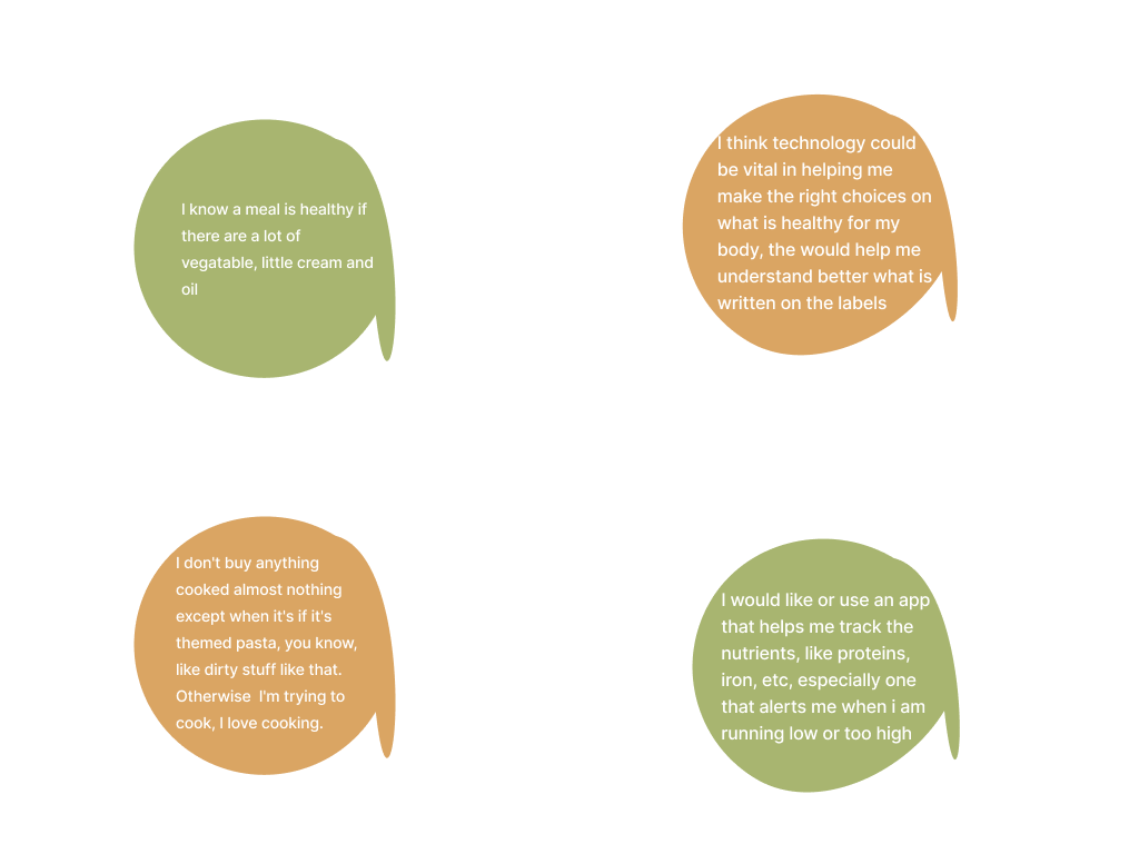
- that most of the users would rather have an application or platform that would help them plan find and plan their healthy meal options and not one that tracks their calories.
- That 50 per cent of the users interviewed would rather go grocery shopping in person, in order to properly check what they are buying
- And finally, most users would welcome and use an application that helps them find, plan and shop for their healthy recipes options.

Conceptualize
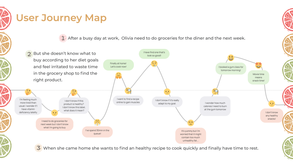
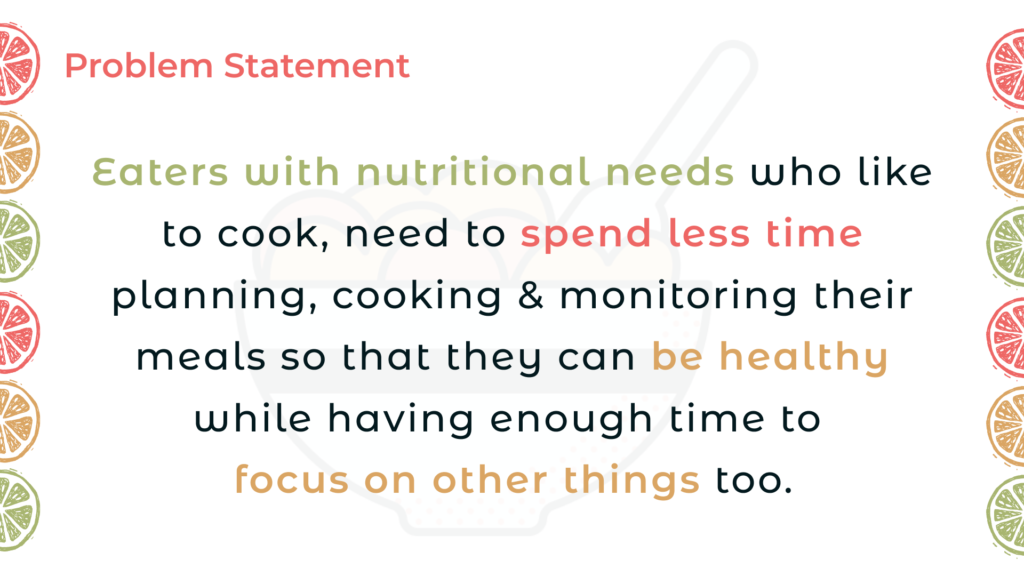
Using affinity diagram, we synthesized the trending insights from the interviews, brainstormed, using the “crazy-8-methods” to arrive at the problem statement. We also created a persona, a user journey map, as well as a concept sketch for the design phase.
The Steps
- Affinity Diagram
- User Persona
- Journey Map
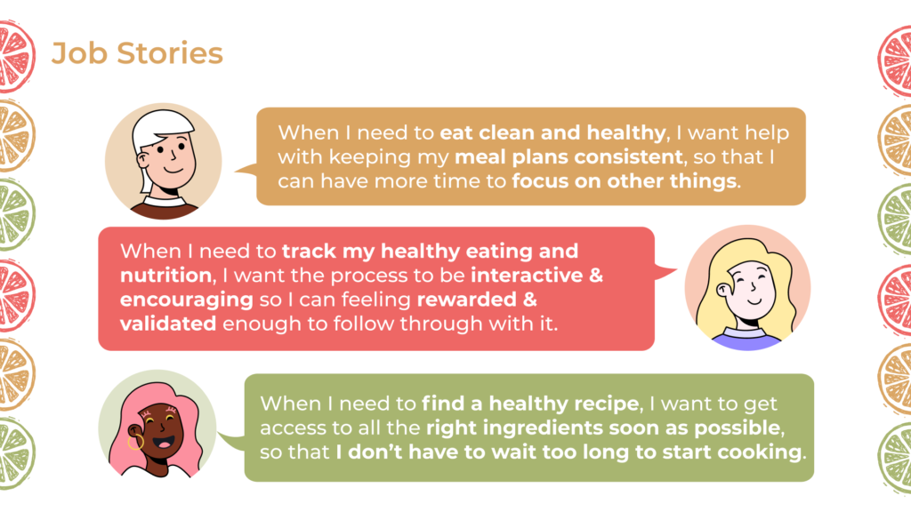
- Job Stories
- Value Proposition Canvas
- Problem Statement
- Moscow & MVP
- Ideation
- User Flow
- Lo-mid Fidelity

Affinity Diagram
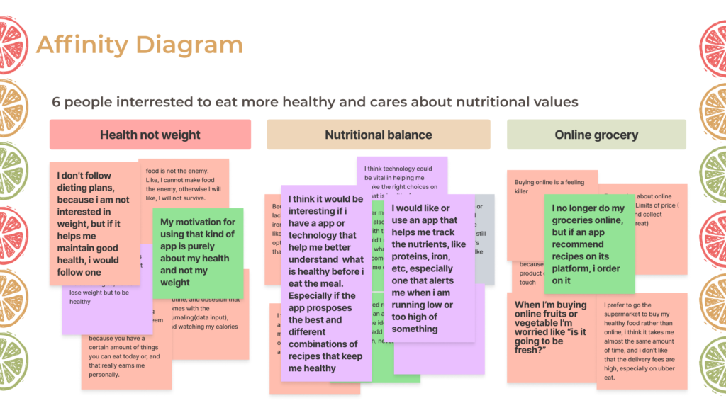
When we looked at the excerpt of the interviews, we found out that most users talked much about the following;
- Health Over Weight
- Nutritional Balance
- Online Grocery
Therefore, we synthesized these trending insights into these super-headers.
User Persona
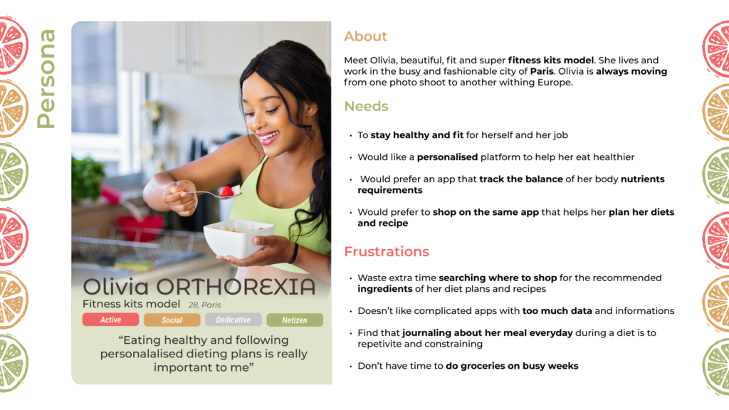
Making the choice for our user persona, was not difficult, using a busy model who likes to eat healthily, but more importantly, prefer to cook her own meal. Therefore for her, the ability to quickly find adapted recipes, cook and keep up with her schedules is a top priority.
Journey Map
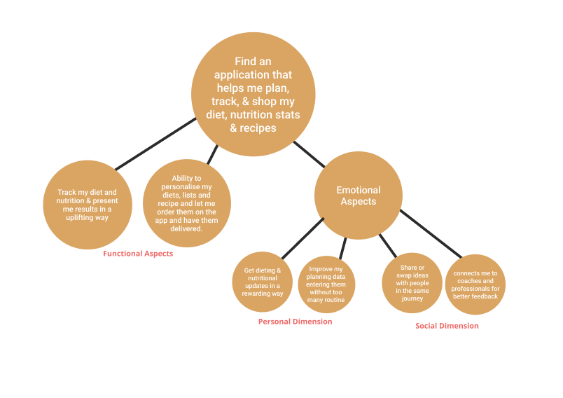
JTBD Stories
Value Proposition Canvas
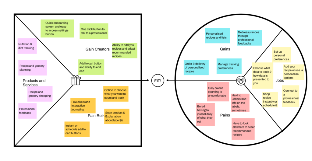
Using value proposition canvas, we were able to map the jobs, gains and pains to the product and services, the gain creators and the pain relievers respectively. This helped us to understand further what tasks or jobs were needed to get the users’ problems solved. The image below showed in detail the mapping.
Problem Statement

Ideate
Moscow Method
Using Moscow Method, we outline the inevitable feature that our product would have, those we think that they should have, could have and those not necessary for the product. A dashboard was one of the key requirements for this challenge, so it appeared at the “Must have” quadrant. Below is the image showing the 4 quadrants and the features we identified.

User Flow
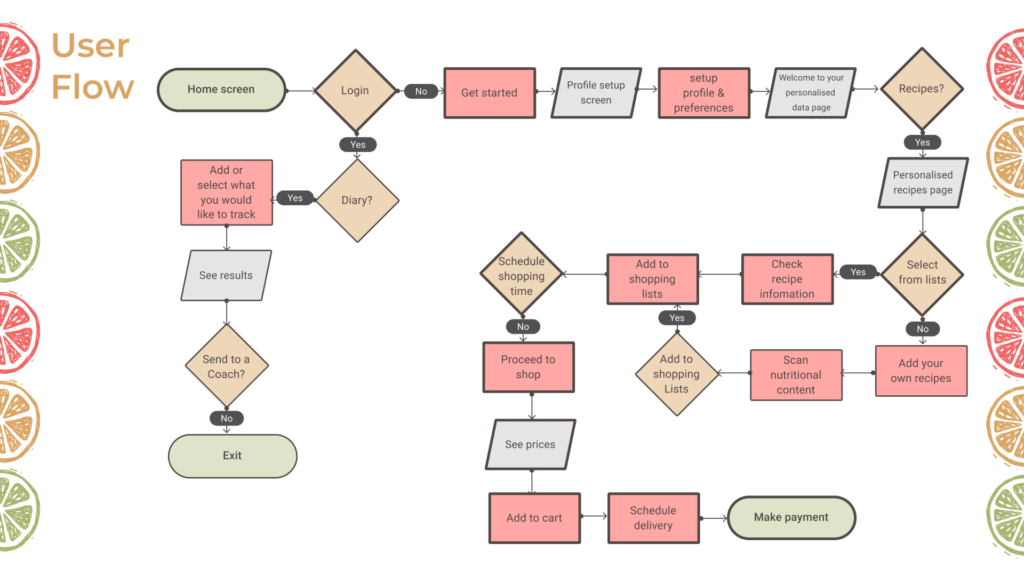
The user flow for the happy path include the following;
- Onboarding & account setup
- Login for existing users
- Personalization and
- Shopping & Payment
Low Fidelity Wireframe.
Mid Fidelity Wireframes
Visual Design
Low and mid fidelity wireframe done, we proceeded to the visual design phase, where we made a decision on the brand visual identity. The phase include the following;
The Steps
- Visual Competitive Analysis
- Moodboa
- style Tyle
- Hgh Fidelity
- Prototyping
- Desirability Testing
Visual Competive Anaysis
Moodboard
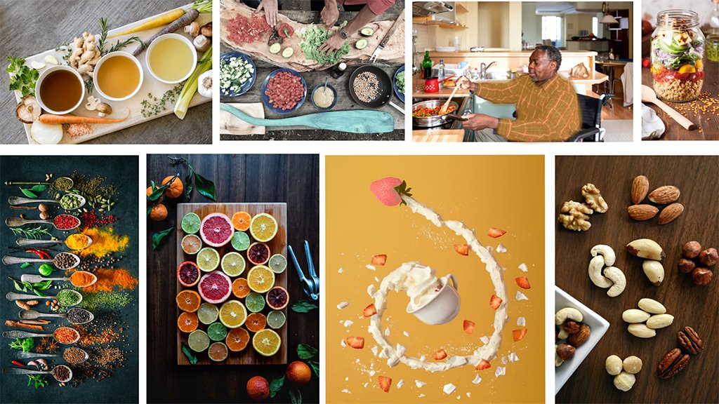
We choose our moodboard to reflect the following adjective;
- Healthy
- Warm
- Playful
- Motivating &
- Resourceful
The decision for the above adjectives was based on the idea that we would like users to eat healthy without feeling like it’s a duty or task they need to accomplish.
Style Tyle
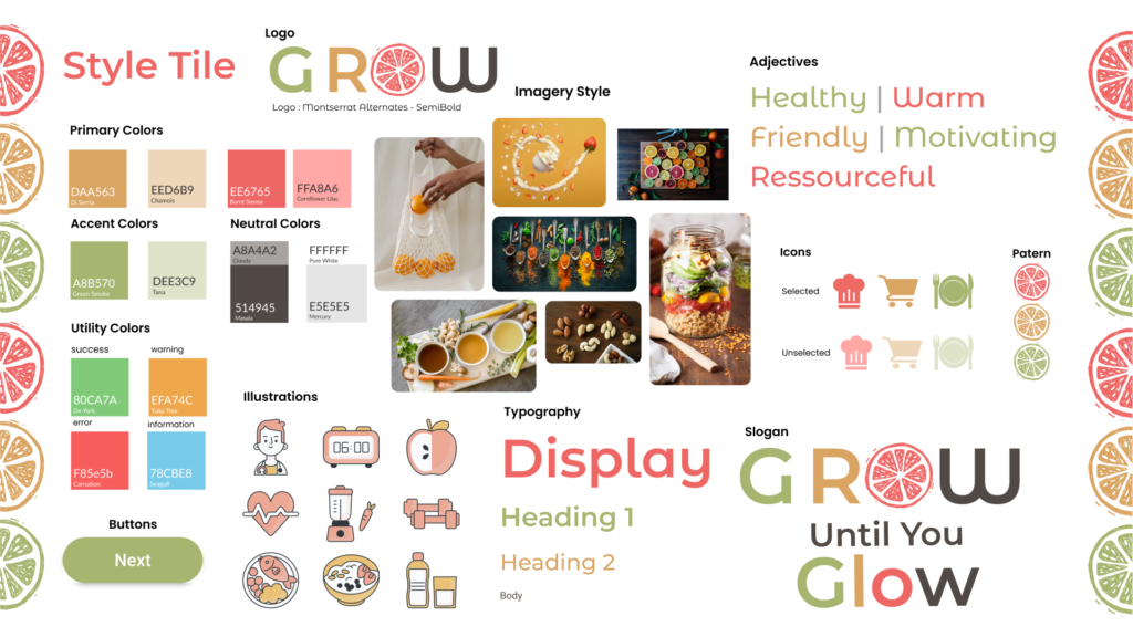
Deciding on our style – colours, typography, logo, icons and elements, we took into consideration what is already existing in the industry as well as what we want our brand to look like, in order to have a unique identity, while staying close to the industry identity. For example, we realised the colours “green” and “orange” is universal in the industry, we kept these colours as our accent colours, and introduce the “indianred”, a very warm but refreshing colour as our primary colour.
For our typography, we decided to go with the following;
- Roboto
- Montserrat Alternative &
- Montserrat
Because we believe that these fonts represent better our playful, and warm identity.
High Fidelity
Grow! Until you glow
We present you “Grow”, a healthy eating app. We chose the name to reflect what we learnt from our users – that wellness with respect to healthy eating should be stress-free, fun and a lifestyle.
Desirability Testing
The diesirability teste we conducted on about five users and peer review we got showed that majority of the users liked our design and would definitely use the product and it’s features. However, there were a few observations by some the users and peers, some of them includes the following;
- Spacing & Alignment – some users observed that there were some spacing issues. Some screens were not properly aligned, while others observed that buttons, eg, the toggle buttons in one of the screens moved positions on clicks.
- Small Navbar – Other users observed that the navbar items were small.
- Small texts – Some thought the texts in some of the pages were small for their eyes.
My Learnings And Challenges
The diesirability teste we conducted on about five users and peer review we got showed that majority of the users liked our design and would definitely use the product and it’s features. However, there were a few observations by some the users and peers, some of them includes the following;

let’s talk.
Lorem ipsum dolor sit amet, consectetur adipiscing elit. Ut elit tellus, luctus nec ullamcorper mattis, pulvinar dapibus leo.
